- MĂIASTRA: A History of Romanian Sculpture in Twenty-Four Parts

- Franklin Sirmans with Hunter Braithwaite
Martine Syms with Christy Gast
Christy Gast
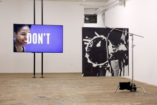
Installation view: Martine Syms: Vertical Elevated Oblique, Bridget Donahue, New York, 2015
CHRISTY GAST (MIAMI RAIL): Let’s begin in Overtown, specifically at the corner of NW 10th Street and 2nd Avenue. You’re creating a series of posters for the backs of buses and bus shelters that point to that corner, the former home of the Harlem Square Club, which was a Chitlin’ Circuit venue where black musicians performed during the segregation era. Your source material includes posters designed by Clyde Killens, a promoter who brought acts like Patti LaBelle, Aretha Franklin, and B. B. King to Overtown.
MARTINE SYMS: The project is a continuation of my commission for the O, Miami Poetry Festival last April. I’m using the same title, Nite Life, which is the name of an Overtown entertainment newspaper from that era. A lot of my works deal with the idea of distribution shaping the form of work. My project for the New Museum Triennial was about the sitcom format, a narrative style and commercial constraint that produces a particular kind of storytelling. I also wrote a book-length essay about the film network that corresponded to the Chitlin’ Circuit, thinking about how those modes of circulation influence the form of the work that gets produced. For O, Miami, I focused on Sam Cooke’s album Live at the Harlem Square Club, which has been a reference point for me personally. It’s an album that I listen to a lot, but I really became fascinated with its history because it was shelved for twenty years. It was recorded in 1963 and not released until 1985. The recording is really raw. The two sound engineers were actually in the audience, so the recording really captures that time and place.
My interest in the album, and in what shifted socially in those twenty years, was my starting point. I used the transcriptions of Cooke’s onstage banter to create a poem, and there was a corresponding performance. As I was researching for that in the Black Archives at HistoryMiami, Clyde Killens kept coming up as a prominent figure. He was a club promoter at multiple clubs. Reading transcripts of interviews with him, you see that he was really a big part of why certain acts were coming to Miami. He was bringing the acts, and he took full responsibility for designing ads for them. His vernacular advertising style is very interesting to me, and I decided to continue working with it when Franklin Sirmans, who is guest curating the project for Locust Projects, approached me. I thought I would continue that site-specific line of inquiry. I’m referring to the advertisements as source material, and I’m reconstituting that and creating more, using the same typography to think about the way these identities circulated. Now they’ll be in proper advertising spaces, which is an interesting continuation of this circulation.
RAIL: There’s a lot to unpack, but I want to start with the Chitlin’ Circuit, venues during the segregation area where African American performers would perform in black communities.
SYMS: The Chitlin’ Circuit arose from hyper-segregated modes of distribution, which were distinct until the 1960s. In film, there was the Jewish market and the black market, which operated within the ghettos of those communities. So if you were making films for a Jewish audience, there was a set of venues where you would screen them. A lot of vaudeville comes out of the parallel histories of black and Jewish entertainment communities. The Chitlin’ Circuit is essentially like a black vaudeville network. There were specific movie theaters, specific venues, many of which are still around. The Apollo Theater in Harlem is probably the most famous one.
The movie theaters actually didn’t fare aswell as the music venues after integration in film started. Venues primarily serving black audiences didn’t have any money anymore. Which is what happened in a lot of places, like in Overtown. A lot of the people I talked to there, including Willie Clarke from Deep City Records, as well as Clyde Killens, said that integration partially took the economic engine out of the neighborhood. So that’s something that’s bittersweet. On the one hand, obviously racism has so many disastrous and negative effects. But because of it, you had businesses that were serving that community, were part of that community, and money was circulating within that community. The second that you didn’t have that restriction anymore, those businesses were at a disadvantage.
RAIL: In an interview I read with Killens, he spoke obliquely about what happened in those twenty years after official segregation was ended, but didn’t name specific events. To me, the era is bookended by two events. In the 1960s, I-95 was built in the middle of Overtown, forcing homeowners out and fracturing the community. In 1980, residents rioted after an all-white jury acquitted four Miami police officers in the beating death of Arthur McDuffie. These events provide a cultural background for the art that was being made at that time. During those twenty years, a lot of entertainers made the shift from the Chitlin’ Circuit to television. Redd Foxx, for example, whose sitcom Sanford and Son was broadcast in the 1980s.
SYMS: Yeah, Redd Foxx was a Moms Mabley protégé. He came very specifically from the black vaudeville tradition, but really got famous because he was recording party records. That popularity led to Sanford and Son, which I think he started in ’74. He wanted to translate that intimate and vernacular style of comedy to television. Richard Pryor was also a writer on Sanford and Son, as was Ilunga Adell, who later made the show My Brother and Me, which I watched on Nickelodeon growing up. Adell started with the Black Arts Movement as a playwright. So those were the kinds of writers that Redd Foxx hired to be on the show. He also had so many guest stars, from LaWanda Page who played his sister-in-law on the show, to various entertainers and guest stars who he knew from his vaudeville era.
There’s this great Killens billboard that’s just all of Redd Foxx’s party record covers. “Redd Foxx!” “Saturday/Sunday!” He is an interesting figure because he bridged two different generations of entertainment. He played those Chitlin’ Circuit clubs, and the touring schedule was really brutal. Even someone like Sam Cooke, who at that time was a big, big star, was still playing these clubs every single night and it was not that glamorous. That was the kind of showmanship they were used to.
RAIL: They lived to perform.
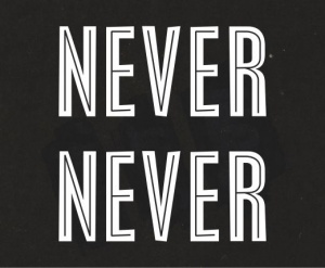
Martine Syms, image from Nite Life for Art on the Move. Courtesy the artist and Locust Projects, Miami
SYMS: Yeah, it was just constant performances from one place to the other, moving from one black community and then driving to the next one, in a time when they couldn’t really stop in other places. There were a lot of hotels and gas stations they couldn’t go to.
RAIL: And there was a lot of in-home family lodging because so many hotels were off-limits to African Americans. At that time, both black and white musicians would play late-night shows at Chitlin’ Circuit venues after shows in, say, Miami Beach. Performers from the Rat Pack would hang out and play all night at clubs in Overtown and Liberty City.
SYMS: Exactly. It was a really dynamic moment. Miami has such a great entertainment history that originates in Overtown in that mid-century moment.
This is part of why I’m drawn to it. A lot of these influences, other popular media, intersected at that moment.
RAIL: One of the bus lines that will carry your posters originates in downtown Miami at the Government Center, where you researched in the archives. A little farther north it stops at the corner where the Harlem Square Club was, and then follows the trajectory of the riots up through Wynwood, and also the trajectory of where people moved after segregation—to neighborhoods farther north. It’s interesting to place that design-based expression of a historical moment on a geographic trajectory.
SYMS: That’s why I wanted them to start in Overtown and move outward in a similar way that a lot of the cultural expression was working. This was a place, like you’re saying, where you would find the craziest kind of combinations, like four giant stars all hanging out at this one nightclub together. I think that shows what the period was like, fruitful creative expression. I’m interested in how that circulated and, like you’re saying, what happened in the ensuing twenty years, between 1965 and ’85.
I usually like to bracket work between two time frames. My background is in film; I approach a lot of things from that perspective. Specifically, I like the idea that the project of film is moving through time and space. Using these origin points to think about what’s been traversed in that time and that is happening now, I’m using it as more source material to draw another relationship from them to me now.
RAIL: Back to the source material, Killens’s posters: black background, simplified portraits, the focus on text. Cropping is a strategy you use a lot in your work. Whether it’s sound, images, photos, or design elements, the way that they’re cropped is really important. How do these elements come together in Nite Life?
SYMS: Cropping has an aesthetic parallel in the idea of “close reading.” I’m isolating different elements to make an extreme focal point. Typographically, I’ve been thinking about the designer Rob Giampietro’s essay “Stereotypography,” in which he traces the lineage of two typefaces, Neuland and Lithos, which are so often used on, like, Native Sun remakes, the Lion King, or sitcoms like Martin and My Brother and Me.
RAIL: Those fonts are used as a generic marker of “ethnic.” Neuland reminds me of Comic Sans.
SYMS: Yeah, it’s really not the nicest looking font. It doesn’t look sophisticated, and I think that’s the point, it looks kind of primitive. So I’m using that font again, combined with another typeface that is based on the heading for Nite Life magazine. I pulled text from Killens’s billboards, which always have some funny descriptions like “brilliant pianist and singer straight from the village gates, New York.” So I’m combining these phrases into “word poems”—and I’m using the word “poem,” but I’m using that fairly loosely, because I don’t really know much about poetry. I’m using that word bank to write new text and take different elements from his designs, so I think that’s where the cropping comes into play. I’m isolating elements that I’m drawn to, the stroke of one of the borders, these phrases, the style of portraiture. It’s really thinking about looking as another way of reading.
RAIL: You’ve recently had your first solo exhibition in a gallery context at Bridget Donahue in New York, and I saw some things happening there that are really condensed in the Overtown project. Cropping was important, as was the way you drew from language, both with words and gestures, to build figures. I saw those sculptures as bodies that express how people are represented through media, specifically black people.
SYMS: I would say, for starters, it’s scary to call them sculptures, but I do think I’m extremely interested in the figure and I’m fully owning that.
Part of my thinking about the show was that I wanted it to look like a film set, so as I was constructing those I was just thinking a lot about this idea of character, which I built on in the Notes on Gesture film. It’s based on an essay by Giorgio Agamben, “Notes on Gesture,” about film as a place that we store our gestures. I disagree, but I’m interested in the idea that movement and gesture are a core language of cinema. I was thinking of this in combination with a series of early Edison films that feature black women moving through the city, and thinking about this idea of subjectivity of the self and what constitutes that, especially in popular media, which is my primary subject matter. I just think it remains a discursive form where ideas and values circulate. I asked myself, “How can I create a character in gesture, and what does that person sound like and look like?” I began researching acting techniques and found the book Chirologia: Or the Natural Language of the Hand by John Bulwer, which was published in 1644. It’s a guide of paralinguistic gestures in Shakespearean theater, which were rigidly coded to have certain effects. There was an emotional coding to it. The film creates an analogue to that, focusing on a black female body.
RAIL: The woodcuts in Chirologia encapsulate gestures with the most simplified image of a hand imaginable, which resonates with the big print of the hand with the tambourine in your Notes on Gesture film in the installation. The woman in that film performs short little gestures over and over in front of a bright purple screen: a short inhalation, a hand gesture, a head tilt and laugh. Elsewhere in the space, a bright purple screen leans against the wall. It works as a minimalist sculpture, nodding to Charles Ray, but it also refers to the green or blue screens used for chroma keying. I thought about something that Coco Fusco said when she was putting together the ICP triennial, that photographic film wasn’t developed to or ever really capable of fully recording black skin. All those references were in that piece for me, and I wonder if that’s what was in it for you?
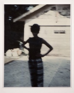
Martine Syms, A Certain Kind of Woman, 2015. Archival pigment print, 127 x 101.6 cm, edition of 3 plus 1 A.P.
SYMS: Yes, I was definitely thinking about white balance, proper exposure, techniques for creating the correct image. I’m interested in shifting ideas of what that correct image is, and even what the right frame of reference of that is. Even with the colors. I began to use purple in relationship to Alice Walker’s book The Color Purple and Oprah’s film adaptation of it. But then in a conversation with Noah Davis, a painter and friend who recently passed away, he said, “I’m so happy to see you using purple because I always use it for stuff.” And I said, “Purple is like the black person’s Yves Klein Blue.”
RAIL: Purple has such an interesting history. In the Roman era it was only available by milking the gland of a murex sea mollusk, and since then it’s been associated with wealth, power, and exclusivity.
SYMS: In addition to that, in Julie Dash’s film Daughters of the Dust she also connects it to indigo harvesting. A motif in the film is everyone’s hands stained purple from the crops.
RAIL: The production of both murex and indigo require super visceral, physical labor that smells bad and stains the skin.
SYMS: Exactly. Conversely, in the book it operates as an indicator of—I think the quote is something to the effect of—“Purple is like God trying to show off,” so it indicates the supernatural in a secular space.
So I think it’s really like a confluence of those ideas for me, a stain that’s also this royal color. It’s like Arthur Jafa says about things that are “scuffed.” He has this idea of black visual inclination, one of them is the idea of things being scuffed.
RAIL: That’s interesting in relation to Michael Taussig’s book What Color Is the Sacred?, where he pulls each color from the spectrum and looks at how it figures into the realm of the sacred, but it’s missing the textural aspect.
SYMS: Everything is scuffed! Everything should be scuffed!
RAIL: Circling back to language and expression, Bridget Donahue was telling me that when people come into the gallery they say things like, “So, tell me about the color purple,” or “So, tell me about that Black Panther.” Those works manipulate the viewer into talking about things that aren’t part of the everyday discourse of a contemporary art gallery.
SYMS: It is really gratifying to me when people utter the phrase “the color purple” in the gallery, it’s like a direct reference to that book, which maybe they read or maybe they haven’t read. When I was shipping the work, one of the shippers who was helping me said, “Look, it’s a Black Panther.” It’s a linguistic play, an object that is a text, an object that does things that text does, like refer and describe. I’m interested in that, and I’m also asking, “Who is the art viewer?” There’s the assumption that the viewer and oftentimes the artist is a white male, or a white person. I’ve been assuming that my viewer is not that. Especially with this work, I think. I’m talking to a black viewer in the way that, maybe, Clyde Killens was. He was talking to more than that, but that could be his presumed audience and I don’t think it’s a limitation. It’s a way of operating. In the same way that we were talking about white balance in photography, as if you’re exposing for a different skin color.
RAIL: Black balance!
SYMS: Yeah! Black balance, it gives you a different image, you know? It relates to this idea of this black visual inclination. What does that aesthetically look like in a formal sense? Not even just conceptually, but what are some formal decisions that can be made in exploring that idea?
Christy Gast is an artist whose work across mediums reflects her interest in issues of economics and the environment.


