
Joseriberto Perez, A Durable Scale of Values
Hunter Braithwaite
Guccivuitton
February 8-March 22, 2014
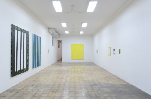
Story goes: Joseriberto Perez grows up in Miami, goes to school at SAIC, moves back home, and paints paints paints for the next several years. In his small studio, finished canvases are stacked like pizza boxes in the bedrooms of the hikikomori, those young Japanese who fear the outside world, finding refuge in the abstractions of their computer screens. Yet here, in Guccivuitton’s Little Haiti storefront, we have an elegant and slim selection of 13 paintings. There are two more in the hallway, and more in the back, hung and stacked. It is the editing, both within the pared down compositions and in the exhibition’s design that reveals Perez’s several different styles. With brush seemingly in each hand, he paints portraits, still lifes, landscapes, and then non-objective scenes that still could turn out to be one or more of the above. They point to the outside world (that Miami of which we never tire) and still slip into that non-world of shape, color and sensual evocation.
The paintings abound with small considerations. Perez has painted the borders of some, and the sides of others to reveal a continual picture plane. On a few, he sinks a line of staples into the sides for good measure. The palette is muted yet still evocative; subtle brushwork allows for an oscillation of blur and clarity has the viewer sliding his glasses up and down the bridge of his nose. You peer through the paint to see windows and vases, creeping foliage, and portraits with no faces, and then peer through those to see more paint: the handling of the greats—Abts, Richter, Klee.
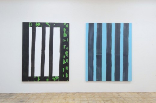
Joseriberto Perez, “those slender at windows” and “a little washed up drift”
Both paintings seem drafted in a small composition on the opposite wall. “Disrupted niche” (8×10 inches), which has the same bars and the same leaves, only changing the blue for yellow. Connections like this run through the exhibition. In many cases, the paring seems to predate the individual paintings.
The exhibition’s title is a bit of concrete poetry lifted from an old copy of National Geographic that at first feels obfuscated, pedagogical, and drab. That said, it is how it came to rest on the press release that connects to how the works came to rest on the walls. They were lifted from somewhere else. Quoting—of styles, of subject matter—is what’s at play. Not allusions to other painters, but rather the physical slice and placement in a new context. Take a random assortment of Perez’s titles:
“green when wet”
“seen but not looked at”
“little pink shores I know not”
Don’t they look seem plucked from previous literature? Wouldn’t Burroughs be proud of my cut-up stanza? In addition to painting’s history, one must also consider the poetics of collage—the elapsed space existing between original and present situation. So again I return to the editing. While I could stare at these paintings all day long, it is the surrounding absence that brings them into focus.


